Copyright © 2025 All rights reserved. Built with love in Texas.
Branding Product SaaS Web App
About a Project School Cafe Menu Planning is a comprehensive SaaS solution designed for K-12 school nutrition teams to streamline meal planning, ensure regulatory compliance, and improve operational efficiency. The app empowers users to build nutritious, balanced menus while simplifying complex nutrition guidelines through close integration with USDA regulations and state-level nutrition standards. Outcomes Increased […]
School Cafe Menu Planning is a comprehensive SaaS solution designed for K-12 school nutrition teams to streamline meal planning, ensure regulatory compliance, and improve operational efficiency. The app empowers users to build nutritious, balanced menus while simplifying complex nutrition guidelines through close integration with USDA regulations and state-level nutrition standards.
Increased Efficiency: Users create compliant menus faster, reducing administrative overhead.
Improved Compliance: Close alignment with USDA regulations helps avoid costly errors and audits.
Enhanced Collaboration: Role-based workflows facilitate teamwork and accountability.
User Satisfaction: Clear, visual interfaces reduce frustration and training time.
Solution: Led the strategic merger of 18 related apps, coordinating 15 designers across 5 focused pods to unify the product experience without losing critical features.
Solution: Deep integration with USDA and state nutrition standards enables real-time validation with clear visual feedback to help users easily meet compliance without expert knowledge.
Solution: Implement role-based access and a clear approval workflow to streamline collaboration and accountability.
Solution: Employ intuitive drag-and-drop interfaces, auto-fill suggestions, and compliance warnings to minimize mistakes.
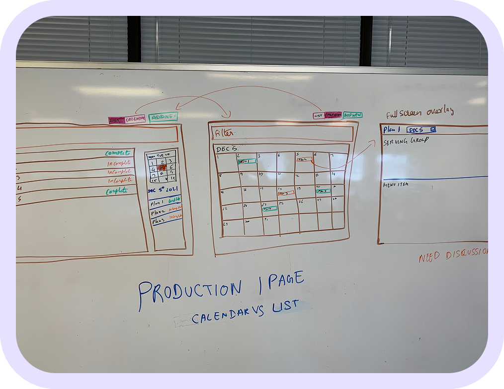
As part of a major transformation, I led the consolidation of 18 related nutrition apps into a single unified platform, coordinating the efforts of 15 designers organized into 5 pods of 3 designers each to deliver a cohesive and scalable product.
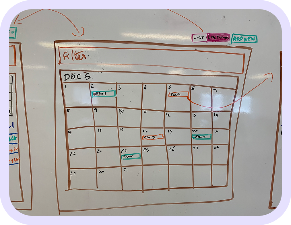
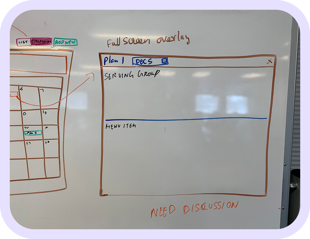
Visual calendar interface allowing users to select days or weeks to plan meals.
Supports drag-and-drop meal creation with clear meal categories (breakfast, lunch, snacks).
Dynamic indicators and alerts showing whether planned menus meet USDA guidelines and state nutrition regulations.
Color-coded nutrition summaries (e.g., calories, allergens, portion sizes) to help users adjust menus on the fly.
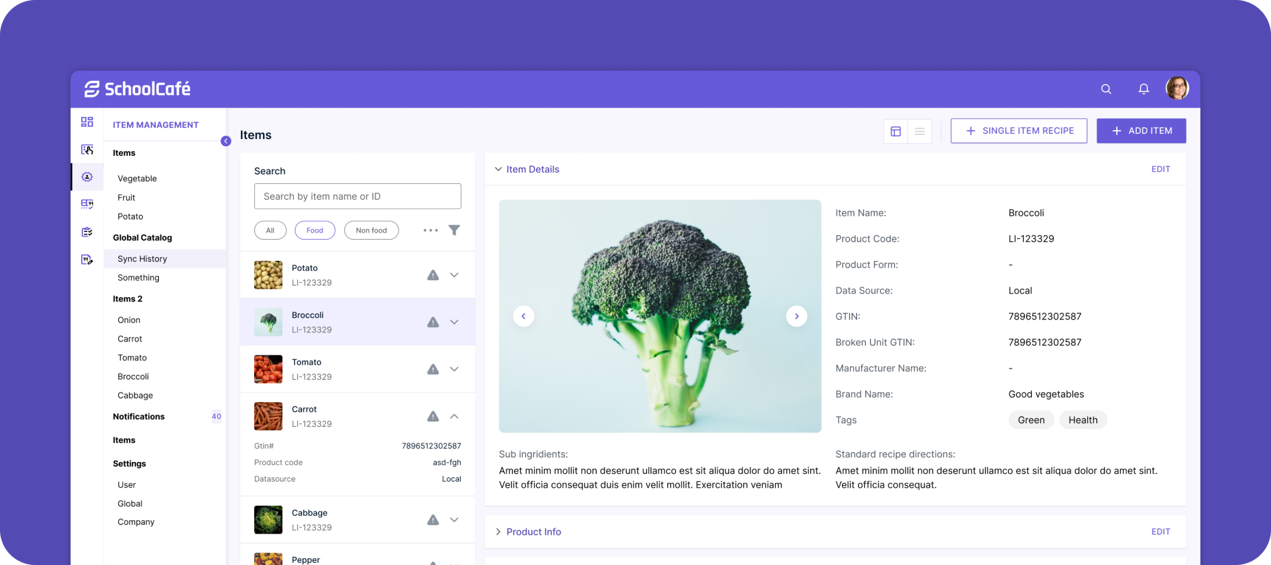
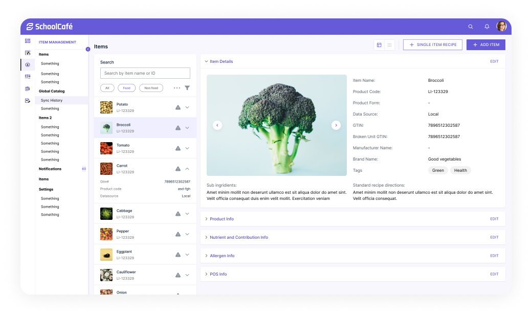
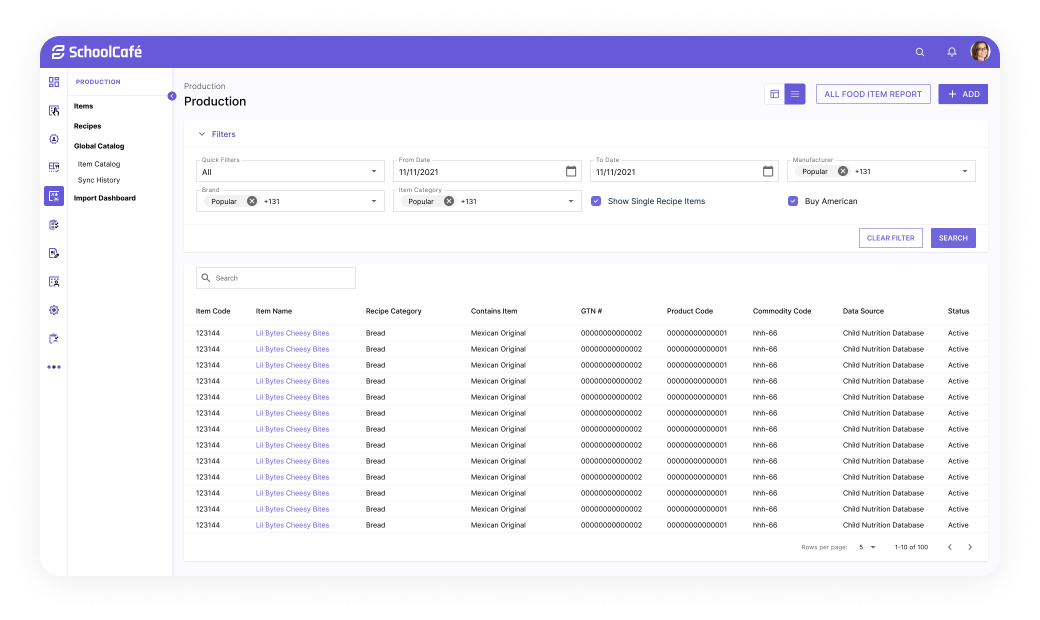
Easily searchable database of USDA-approved food items and recipes with nutrition facts.
Filters for dietary restrictions (gluten-free, vegetarian) and ingredient substitutions.
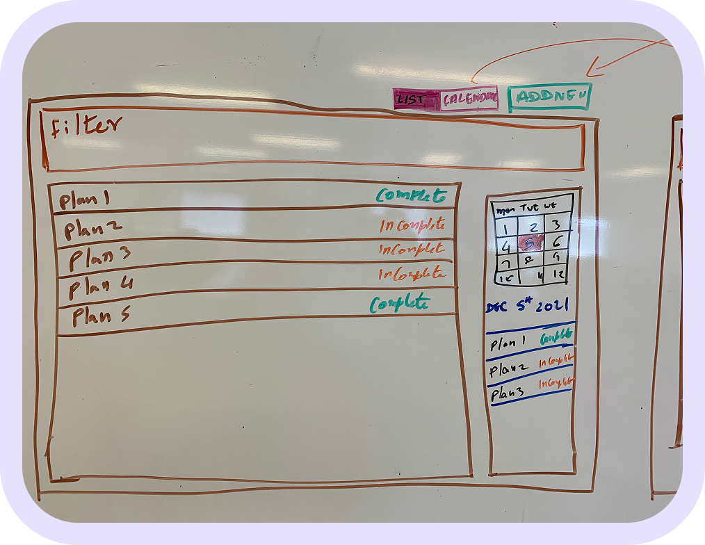
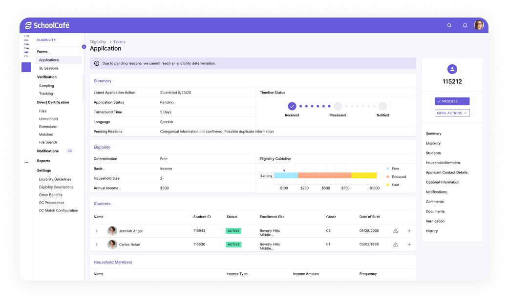
Ability to submit menus for review and approval within the team or by external compliance officers.
Status tracking and notifications for pending, approved, or rejected menus.
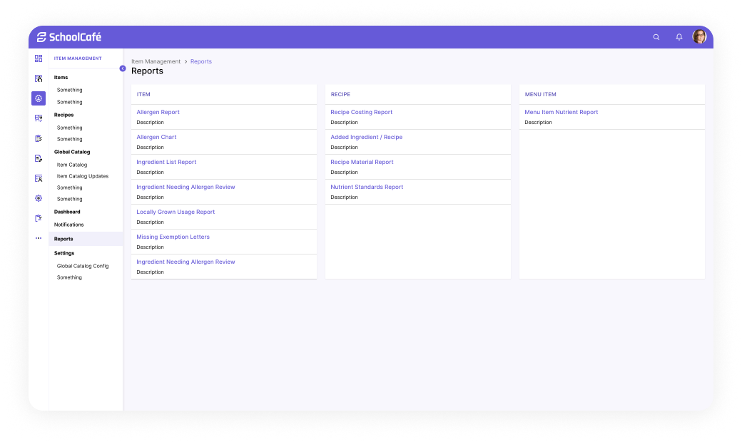
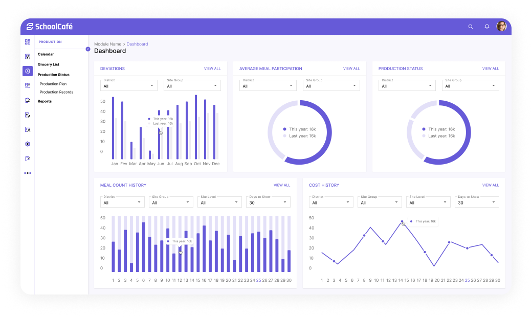
Visual reports on menu compliance, ingredient usage, and meal counts to aid budgeting and audits.
Exportable data tailored for regulatory submissions and internal records.
Role-based access allowing planners, approvers, and viewers to collaborate securely.
Customizable notifications and alerts based on user roles.
Initial concepts were designed in low-fidelity and tested across four rounds:
Round 1: Flat layout with labels only
Round 2: Added field grouping and section titles
Round 3: Inline hints and tooltips
Round 4: Toggle between structured/free-text modes
Changes were made after observing field fatigue and misinterpretation during usability testing.
Professional, clean color palette with blues and greens to convey trust and health.
Clear, legible typography optimized for desktop and tablet use.
Modular cards and tables for menu items and nutrition data.
Interactive elements like sliders and toggles for portion sizes and ingredient adjustments.
Consistent use of icons and tooltips to explain nutrition terms and compliance requirements.
High contrast for readability in busy school kitchen or office environments.
Responsive layouts for desktop and tablets, supporting on-the-go planning.
Shortly Describe the problem
The original screen displayed appointment notes in a flat list format with minimal context. Clinicians had to scroll through repetitive entries and lacked insight into documentation completeness. Data was not actionable.
Pain Point: No visibility into what needs attention. High cognitive load.
Introduced visual indicators (color-coded chips and completion bars) to surface documentation status at a glance. Added side panel with quick documentation preview.
Improvement: Better prioritization. Clinicians can triage and batch-document faster.
Replaced passive preview panel with actionable fields. Added summaries, history, and visual progress gauge. Moved from passive reading to interactive editing.
Improvement: Enabled quick entry of key details. Reduced screen-switching.
Structured fields now embedded directly in the interface. Smart defaults, validation, and tags support accurate input. Data now cleanly maps to EHR.
Improvement: Improved data quality and speed. Enabled future automation and scalability.
Final iteration includes collapsible sections, saved state indicators, and user-role conditional fields. Optimized for tab-based navigation and fast-entry workflows.
Improvement: Clinicians document faster with fewer clicks. Data is reusable, clean, and export-ready.