Copyright © 2025 All rights reserved. Built with love in Texas.
Mobile SaaS
Lorem ipsum dolor sit amet, consec tetur adipiscing elit.
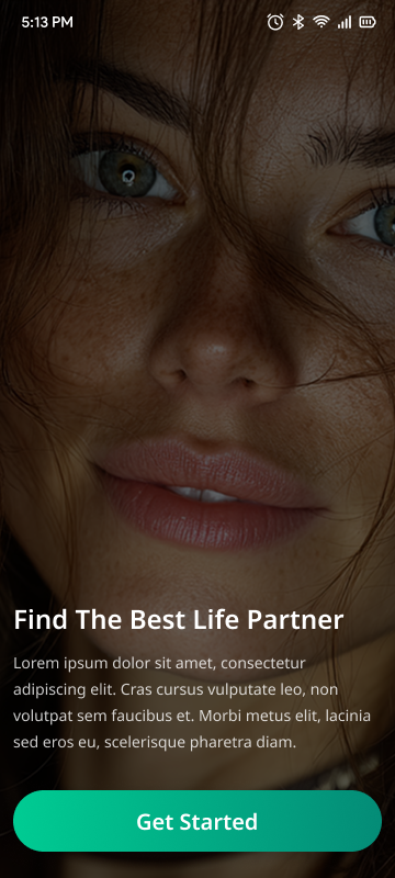
The dating app “Milaap” is designed to facilitate meaningful connections through a swipe-based matching system, combining visual appeal with seamless interaction. The goal is to provide an engaging, intuitive, and accessible experience that encourages users to discover potential partners efficiently and naturally.
Young adults aged 18-35 seeking romantic relationships or casual dating
Tech-savvy individuals accustomed to mobile apps
Users valuing quick, intuitive interactions with rich profile details
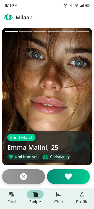
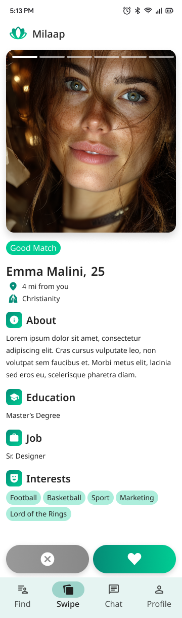
Name: Emma
Age: 25
Occupation: Sr. Designer
Interests: Sports, marketing, movies
Goals: Find compatible matches quickly without overwhelming information
Pain Points: Overly complex apps, unclear navigation, poor profile data quality
Function: Allows users to quickly indicate interest by swiping right (like) or left (dislike).
Design: Large photo cards with minimal yet clear profile info to encourage quick decisions.
User Flow: Users swipe through profiles and receive instant feedback on matches.
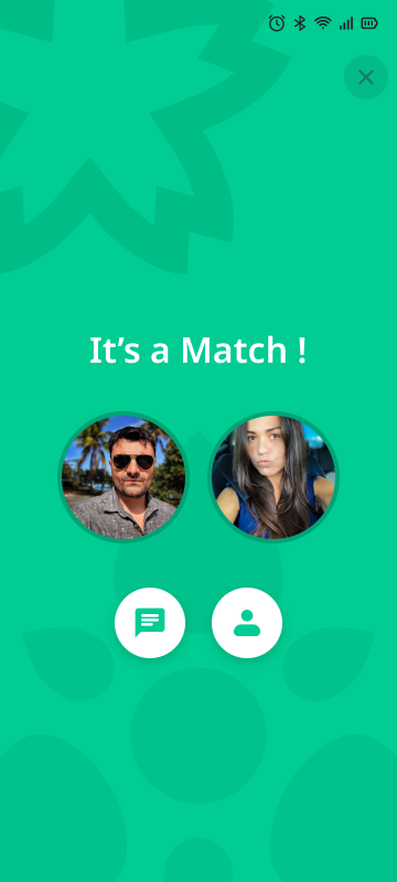
Function: Celebrate a successful mutual like with a visual confirmation.
Design: Show profile photos of both users, plus quick action buttons to start chatting or view profiles.
Purpose: Reinforce positive user emotions and encourage next steps (chat).
Function: Provides more in-depth information on a potential match.
Design:
Large profile photo with story highlights.
Clear sections with icons: About, Education, Job, Interests.
Interests presented as tags for quick scanning.
Location and religion as additional context for compatibility.
UX Goal: Make important details accessible without clutter, using clear hierarchy and iconography.
Tabs: Find (browse matches), Swipe (active swiping interface), Chat (messages), Profile (user settings).
Design: Intuitive icons and labels with a focus state highlight for easy navigation.
Clean, modern colors focused on greens and neutrals to evoke calm and trust.
Readable typography with clear hierarchy (headings bold, body text smaller).
Buttons with high contrast for accessibility.
Simple, friendly icons (info, education, job, interests) to visually organize content.
Consistent use of rounded shapes in buttons and tags to create a welcoming atmosphere.
Smooth swipe animations.
Immediate feedback on matches and button presses.
Modal overlays for important actions (e.g., confirming a match).
High color contrast for text and buttons.
Clear font sizes and spacing for readability.
Touch targets sized appropriately for mobile use.
Responsive layout adapting to various screen sizes.
Solution: Use a layered approach — minimal info on swipe cards; detailed info on tap.
Solution: Prominent, inviting action buttons on the match screen to start conversation or view profile.
Solution: Use clear iconography with labels, consistent placement of navigation elements.
Increased User Engagement: Fast, intuitive swiping keeps users active.
Improved Match Rates: Clear match confirmation encourages communication.
User Satisfaction: Easy access to profile info builds trust and connection potential.
Brand Identity: Consistent visual language creates a professional, friendly feel.