Copyright © 2025 All rights reserved. Built with love in Texas.
Branding Product SaaS Web App
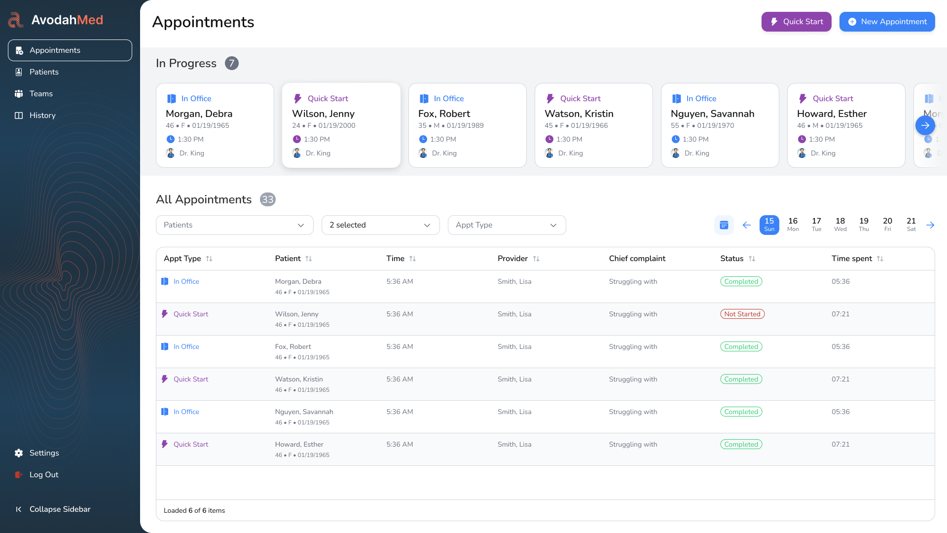
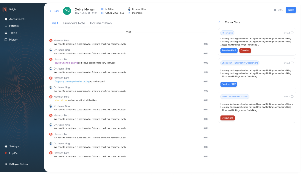
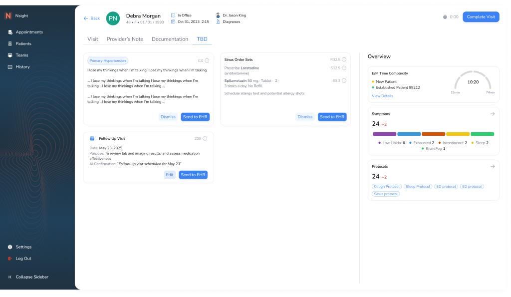
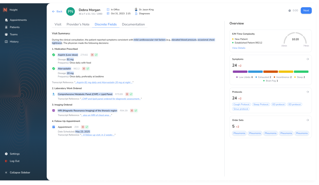
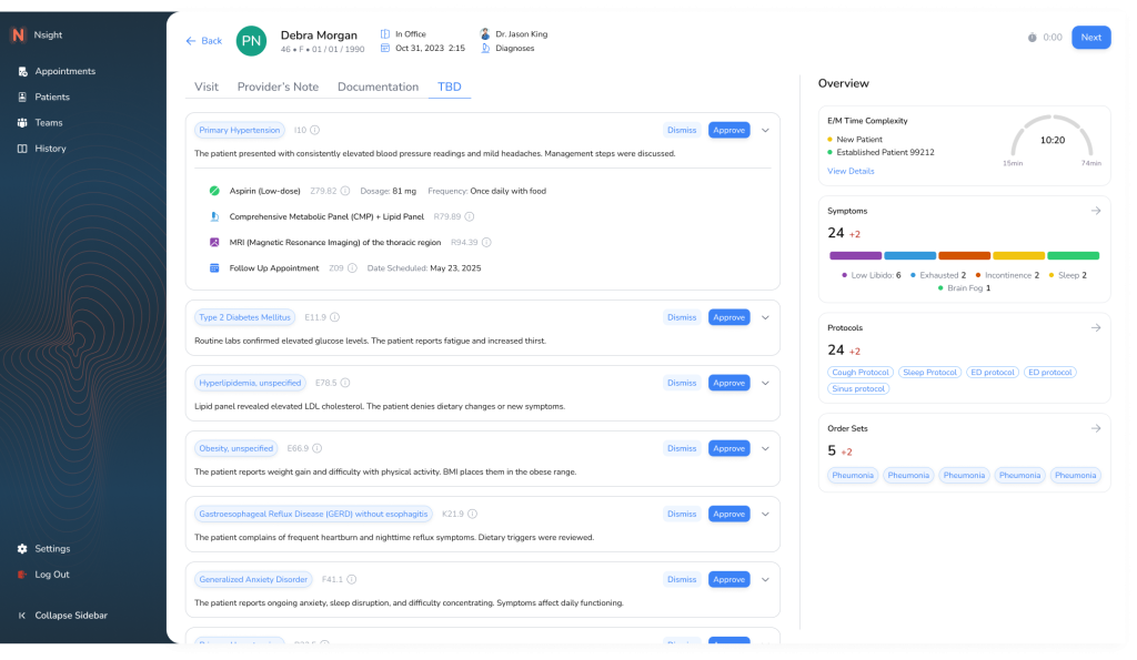
About a Project Avodah Med is a clinical platform designed to streamline appointment documentation, improve clinician efficiency, and ensure structured, compliant medical data output. The platform was built with direct input from providers and optimized for HIPAA compliance, accessibility, and ease of use across desktop and mobile. Outcomes Successfully launched cross-platform app (iOS & Android) […]
Avodah Med is a clinical platform designed to streamline appointment documentation, improve clinician efficiency, and ensure structured, compliant medical data output. The platform was built with direct input from providers and optimized for HIPAA compliance, accessibility, and ease of use across desktop and mobile.
Successfully launched cross-platform app (iOS & Android)
Achieved 99% crash-free sessions in the first 60 days
Created a scalable mobile UX library for future projects
Clinicians were documenting patient interactions in large, unstructured text blocks. This caused:
Increased documentation time
Inconsistent records
Difficulties with data retrieval and billing
As a hands-on director of UX & Design, Led product design, UX research, design systems, and worked closely with product and engineering teams to bring the vision to life. I also oversaw the mobile design strategy and collaborated directly with our clinical advisors.
Transform unstructured appointment notes into structured, discrete fields that:
Align with SOAP and clinical workflows
Enable dynamic validation and autofill with AI
Improve documentation quality and billing readiness
HIPAA & CMS compliance
AI-tech constrains
Legacy data model dependencies
Mixed user base: new and tech-savvy clinicians
About a user adipiscing elit. Ut elit tellus, luctus nec ullamcorper mattis, pulvinar dapibus leo.
Dr. Maria J., Internal Medicine
Needs: Speed, accuracy, familiarity
Frustrations: Overloaded fields, manual data entry, error-prone workflows
Goals: Document quickly and bill accurately
8 user interviews with clinicians (MDs, PAs, RNs)
Competitive analysis of similar documentation tools
Heuristic evaluations of existing documentation systems
Initial concepts were designed in low-fidelity and tested across four rounds:
Round 1: Flat layout with labels only
Round 2: Added field grouping and section titles
Round 3: Inline hints and tooltips
Round 4: Toggle between structured/free-text modes
Changes were made after observing field fatigue and misinterpretation during usability testing.
Built atomic components in Figma using auto layout and variants
Created color and type tokens for WCAG AA compliance
Defined spacing, elevation, and reusable templates for consistency
Shortly Describe the problem
The original screen displayed appointment notes in a flat list format with minimal context. Clinicians had to scroll through repetitive entries and lacked insight into documentation completeness. Data was not actionable.
Pain Point: No visibility into what needs attention. High cognitive load.
Introduced visual indicators (color-coded chips and completion bars) to surface documentation status at a glance. Added side panel with quick documentation preview.
Improvement: Better prioritization. Clinicians can triage and batch-document faster.
Replaced passive preview panel with actionable fields. Added summaries, history, and visual progress gauge. Moved from passive reading to interactive editing.
Improvement: Enabled quick entry of key details. Reduced screen-switching.
Structured fields now embedded directly in the interface. Smart defaults, validation, and tags support accurate input. Data now cleanly maps to EHR.
Improvement: Improved data quality and speed. Enabled future automation and scalability.
Final iteration includes collapsible sections, saved state indicators, and user-role conditional fields. Optimized for tab-based navigation and fast-entry workflows.
Improvement: Clinicians document faster with fewer clicks. Data is reusable, clean, and export-ready.